
Amazon SES Checklist
Account dashboard
This is the AWS Amazon Simple Email Service (SES) console
Here we can find;
1. Sending Limits
- Daily sending quota: 80,000 emails per 24-hour period
- Maximum send rate: 14 emails per second
- Option to request a limit increase is available
2. Account Health
- Always check Region: Asia Pacific (Mumbai) and
- Status: should be Healthy
3. Daily Email Usage
Daily email usage helps you to monitor your daily sending statistics to ensure you aren’t approaching your sending limits.
Metrics:
- Emails sent
- Remaining sends
- Sending quota used


4. Sending Statistics
- Charts available showing successful send requests, rejection rates, bounce rates, and complaint rates for the Mumbai region.
- Can use the Date range dropdown and select date values from Last 1 day to Last 14 days to filter the charts
- Each chart contains a View in CloudWatch button that will open the respective metric in the CloudWatch console allowing detailed data to be viewed, customized metric math, and the creation of alarms
Reputation metrics
The Reputation metrics page gives you a look into two key metrics that Amazon SES takes into account when evaluating your sender reputation and the health of your account.
Sender Reputation
- It's how email providers (Gmail, Yahoo, etc.) judge whether your emails are trustworthy
- A bad reputation = your emails land in spam or get blocked entirely
- A good reputation = emails reach the inbox
Why It Matters Practically
1. Summary
Account Status - It shows whether your account is in good standing based on how many emails bounce or get marked as spam.
There are 3 possible statuses:
- Healthy: Everything looks good, keep sending normally.
- Under Review: Something triggered a warning; your account is being monitored.
- At Risk: Your account has serious issues and may lose the ability to send emails.
Emails Sent (Last 24 Hours): How many emails you've sent today.
Remaining Sends: How many more emails you can still send today.
Sending Quota Used: The percentage of your daily email limit you've already used (e.g., 60% means you've used more than half your daily allowance).
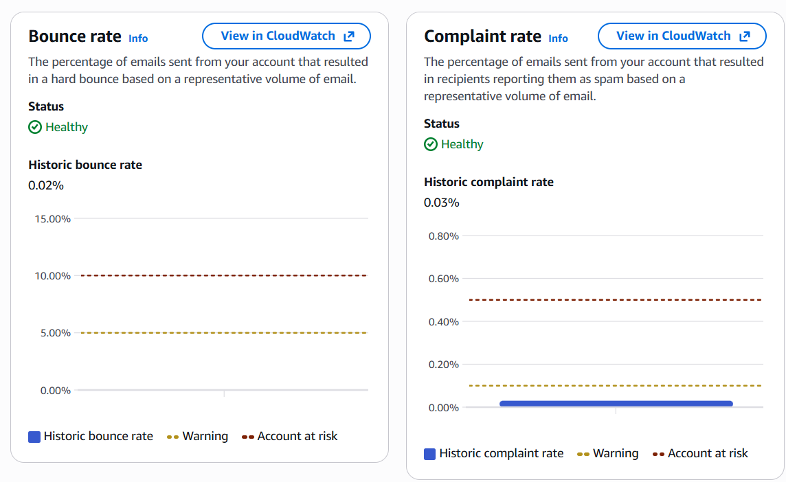
2. Bounce rate
- Emails that couldn't be delivered (invalid addresses, full inboxes). High bounce = danger signal
- Historic bounce rate - This rate is calculated using a representative volume of mail, which is displayed in the *Summary* section under Messages sent. This rate shows how healthy your account is for sending messages at a general level and shouldn't be mixed up with your usual bounce rate, which relates to specific bounce events happening in real-time.
3. Complaint rate
How many recipients marked your email as spam. Even a small % can hurt badly
Things to check on weekly basis:
This page is essentially the health report of your email program, ignoring it risks getting your account suspended and losing the ability to send emails entirely.
Identities
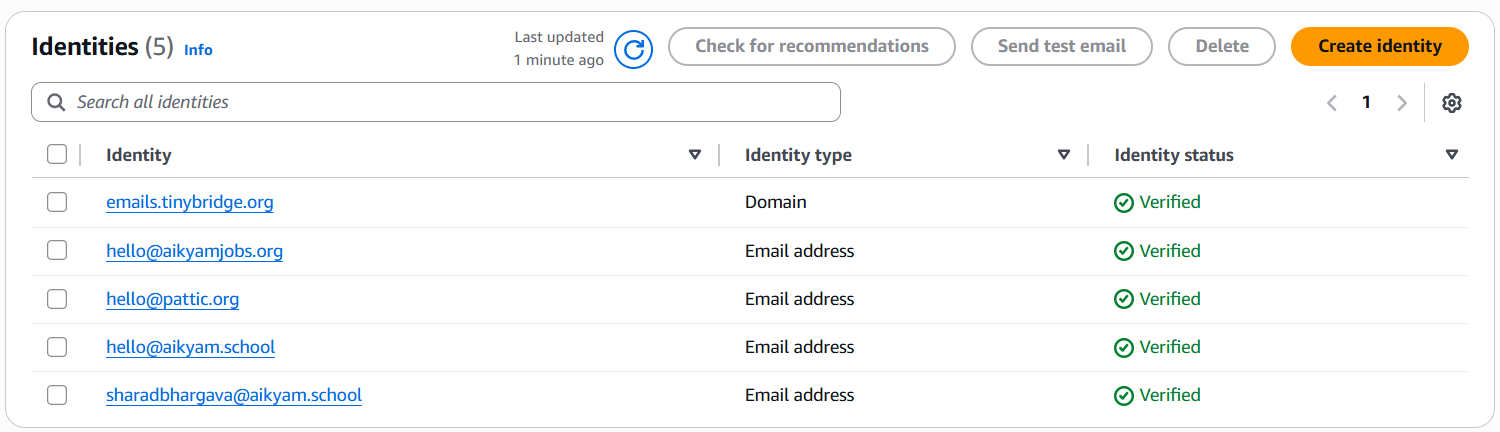
From here we can understand;
How many sending sources your SES account is managing
Identities Matter Because;
emails.tinybridge.org) is more powerful than a single email address. It covers all emails under that domain
Proper setup of identities directly impacts whether your emails pass spam filters
Suppression List
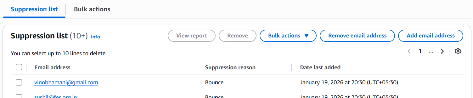
Those emails we are block listed in Listmonk will reflect here
Actions Available;
Suppression list tab - View/manage individual suppressed addresses
Bulk actions tab - Add or remove addresses in bulk
Account-level settings
This means SES will automatically suppress (block sending to) any email address that has previously bounced or been marked as spam/complaint.
Important;
Virtual Deliverability Manager (VDM) Dashboard
The dashboard provides both a broad and detailed perspective on your account’s deliverability program - featuring easy-to-understand graphic cards that display deliverability and reputation through bounce/complaint statistics, as well as open/click and delivery rates. You can also dive into specific table data when there’s a problem related to a certain ISP, sending identity, or configuration set linked to an email campaign.
Date range: you can select either Relative range (default) or Absolute range for the timeframe to be used in analyzing your deliverability stats and metrics:
Key Metrics:
Metrics
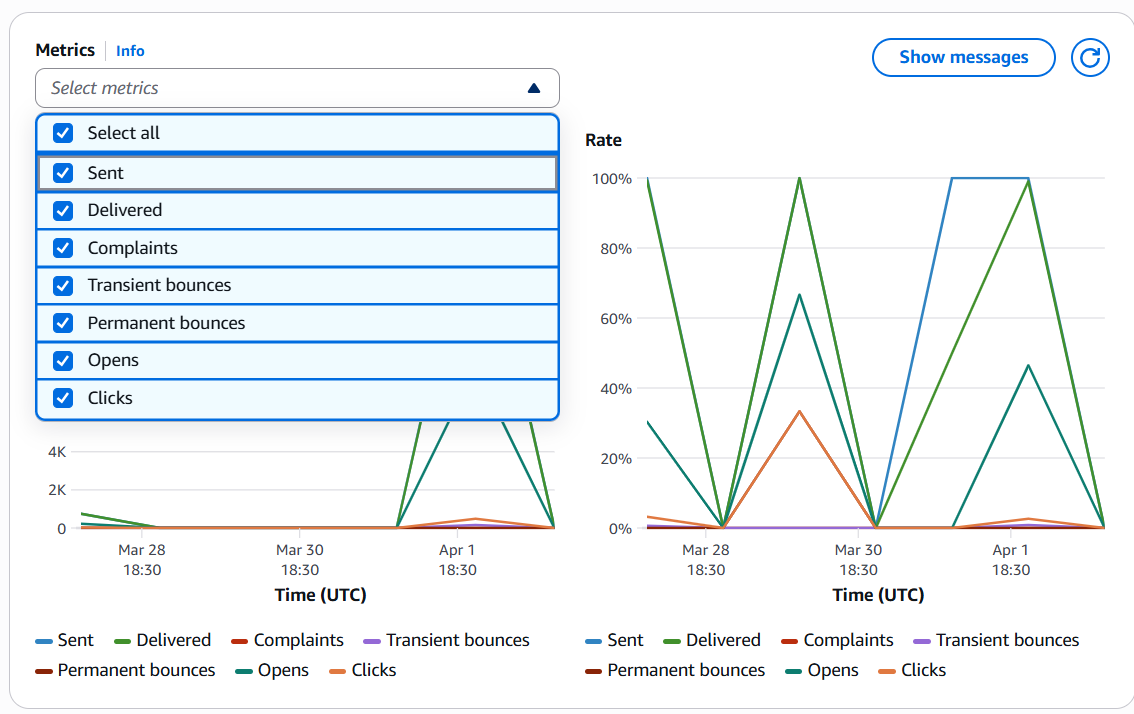
The Metrics pane shows all VDM metrics in the form of time series graphs, with Volume progression displayed on the left side and Rate progression on the right side. It has a set aggregation period of 1 day, which illustrates the progression for the date range you choose at the top of the page. You can filter the metrics you wish to view on the chart by using the Select metrics dropdown.